 GECKO
GECKO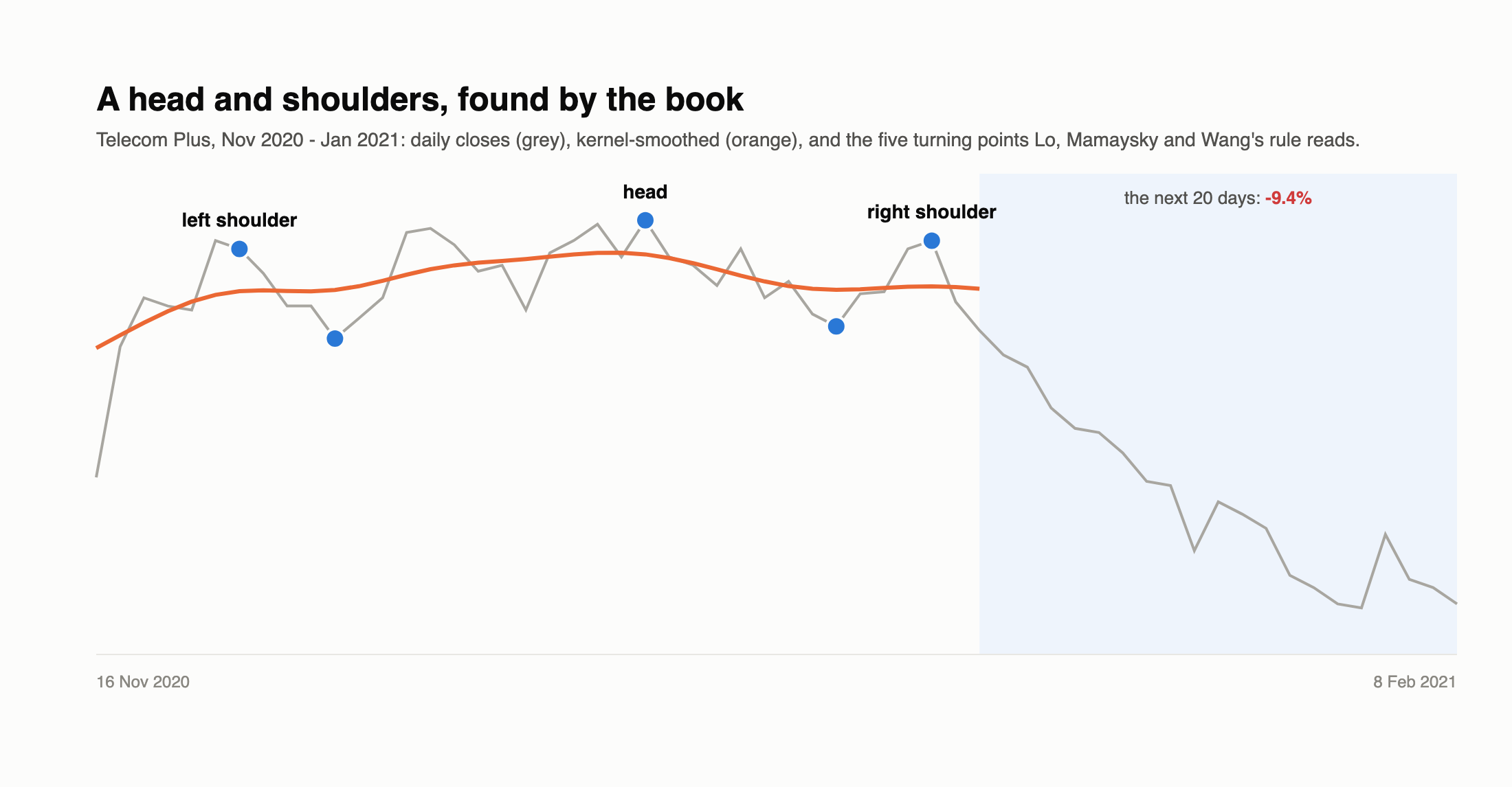
TL;DR
- The question: our cup and handle and bull flag detectors rested on our own judgement calls. Would a formal, published definition do better?
- The source: Lo, Mamaysky and Wang, Foundations of Technical Analysis (Journal of Finance, 2000) - the best-known attempt to define chart patterns mathematically.
- The findings: across 296,361 stock-days of UK data, none of the bullish patterns was followed by better-than-average returns. The results flipped sign with one smoothing setting, and many detections don’t look like their names to the eye.
- One consistent effect: after a double top, returns were a little below average at every setting - a bearish signal, but smaller than trading costs.
- Verdict: fail. A rigorous definition makes detection reproducible; it doesn’t make the patterns predictive.
The method
The paper turns chart reading into three steps:
- Smooth the prices. Over a 38-day window, daily closes are smoothed with kernel regression - each day’s smoothed value is a weighted average of nearby closes, with weights fading away like a bell curve. How wide that bell is (the bandwidth) decides how much detail survives.
- Find the turning points - the peaks and troughs of the smoothed curve - and match each to the actual highest or lowest close beside it.
- Apply a rule to the last five turning points. For example, a head and shoulders is a peak, then a higher peak (the head), then a third peak about as high as the first (within 1.5%), with the two troughs between them also roughly level. Ten patterns are defined this way: head and shoulders and its inverse, and the top and bottom versions of broadening formations, triangles, rectangles and double tops/bottoms.
Gecko only ever uses prices up to the day it acts: a pattern counts when its last turning point has just happened.
The first surprise: the recipe doesn’t smooth
The paper chooses the bandwidth statistically (by cross-validation) and then deliberately cuts it to 30%, because the statistically chosen curve was judged too smooth to show the patterns a chartist would see. Applied literally to daily UK share prices, though, the statistical choice is almost always the narrowest bandwidth on offer - about one day - because the best predictor of a share price is the price next to it. Cut to 30%, that leaves the prices essentially unsmoothed, and every daily wobble becomes a “turning point”.
So the bandwidth became a setting, chosen by looking at the curves - which is, in the end, how the authors settled on their own 30%. Gecko tested 2 and 3 days.
What it found
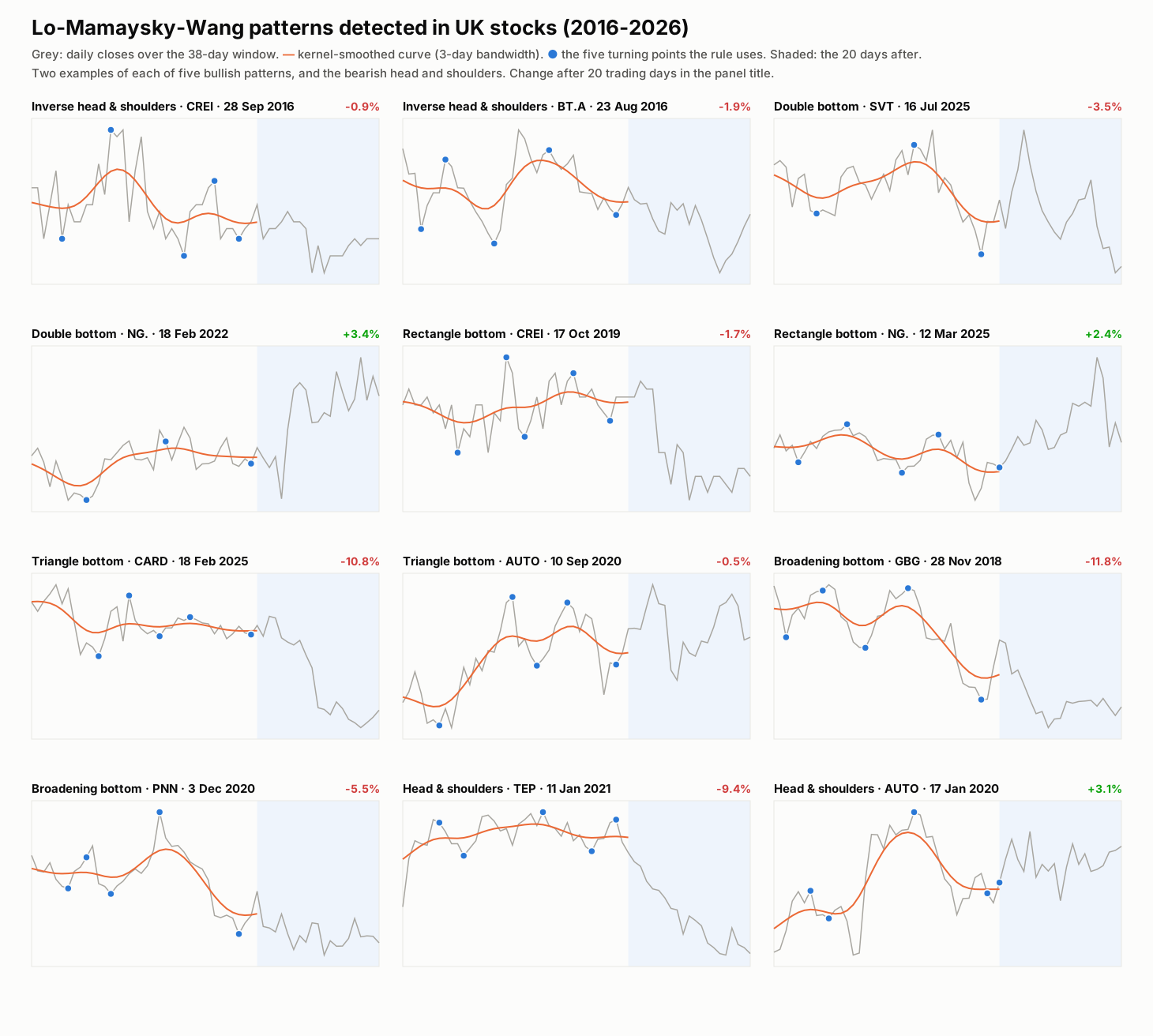
The rules are met - but look at them with a chartist’s eye and many are hard to recognise. On a 38-day window of noisy prices, “five turning points in the right order” is easy to satisfy by chance.
Did they predict anything?
The paper’s own kind of test: compare what happened in the 20 trading days after each pattern with what happened after an ordinary day (+0.68% on average, 2016-2026).
| Pattern | Traditional reading | 2-day smoothing | 3-day smoothing |
|---|---|---|---|
| Inverse head and shoulders | bullish | -0.02% | +0.87% |
| Double bottom | bullish | +0.29% | -0.22% |
| Triangle bottom | bullish | +0.21% | +1.16% |
| Rectangle bottom | bullish | -0.16% | -0.49% |
| Double top | bearish | -0.36% | -0.69% |
| Triangle top | bearish | +1.10% | +1.57% |
(Returns relative to an ordinary day. Several hundred to over a thousand examples of each at 2-day smoothing; fewer at 3 days.)
Three things stand out:
- The bullish patterns don’t beat an ordinary day in any consistent way.
- Results flip with the smoothing setting. An effect that changes sign when you adjust how much you smooth isn’t a property of the market - it’s noise.
- A “bearish” pattern was followed by above-average returns. The triangle top did better than average at both settings - the opposite of its reading.
The only pattern that behaved as tradition says, at every setting, was the double top: returns a little below average. But the effect - well under 1% over a month - is about the size of trading costs, and trading it would mean selling short.
Because no bullish pattern beat an ordinary day even before costs, Gecko didn’t run full trading backtests: after spreads, commission and financing they could only do worse.
Verdict
Fail. A published, mathematical definition is valuable - it makes detection reproducible and answers “did we miss any?” by fixing the procedure rather than relying on judgement. But it doesn’t make the patterns predictive, and it carries judgement calls of its own (the bandwidth, the window length). The original paper concluded that patterns carry some information; on UK stocks, what we see is small, unstable and not worth trading.
Across the three chart-pattern studies the message is the same: shapes on their own don’t predict prices here. The one edge Gecko has found - EVS Drift - comes from volume marking real news, and that points to where to look next: technical timing combined with fundamental information, rather than instead of it.