 GECKO
GECKO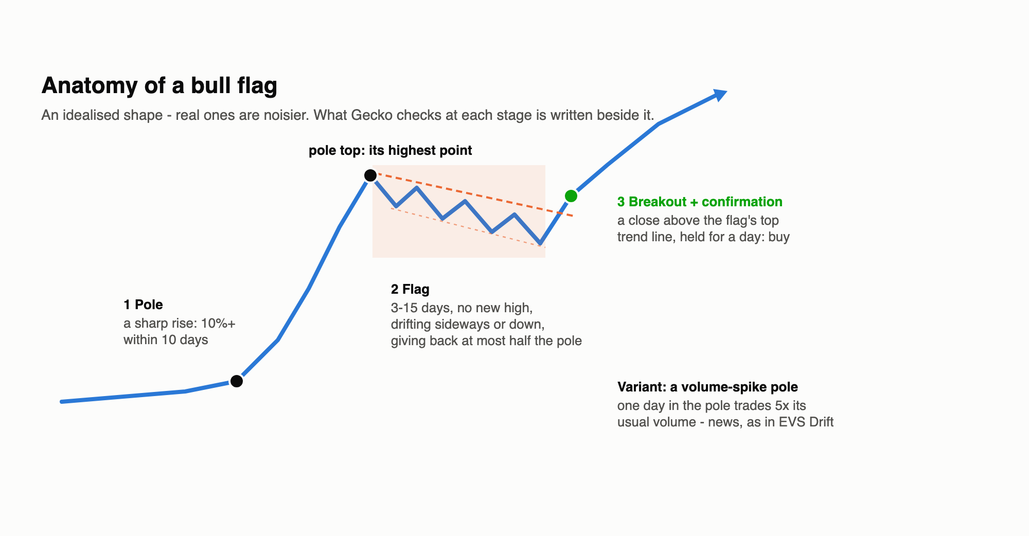
TL;DR
- The pattern: a sharp rise (the pole), a short pause that drifts sideways or down (the flag), then a breakout to carry on upwards.
- Easy for code, plentiful in the data: unlike the cup and handle, every part of a flag is easy to measure. Gecko found 1,929 of them - plenty to test properly.
- On their own, they predict nothing. With a sensible stop, flags after any sharp rise were a coin toss before costs and lost money after.
- The textbook stop is too tight. A stop just under the flag was hit in about two trades out of three.
- Volume is what matters: flags whose pole contained a volume spike were the only profitable version - but buying straight after the spike (EVS Drift) did much better than waiting for the flag.
The pattern
The story behind the flag: a burst of buying drives the price up quickly, then some early buyers take profits and the price drifts back a little - but not much, because buyers are still keen. When the drift ends and the price breaks out above the flag, the move is supposed to resume. Traditionally the target is the pole’s height again, added on above the breakout.
Turning it into rules
| The eye sees | Gecko’s rule (daily candles) |
|---|---|
| A pole | a rise of 10%+ within 10 days; its top is the highest point of the pole |
| A flag | 3-15 days that make no new high, give back no more than half the pole, and don’t drift upwards |
| A breakout | a close above the flag’s top trend line (fitted through its highs), still above it the next day - then buy at the next open |
| (optional) A news-driven pole | one day in the pole trades at least 5x its usual volume |
This was far easier than the cup and handle: no fuzzy “roundness” to argue about. One correction was still needed after looking at the detections: the first version sometimes put the “top” of the pole partway down a fall from an earlier peak. Requiring the pole’s top to be its highest point fixed it.
What it found
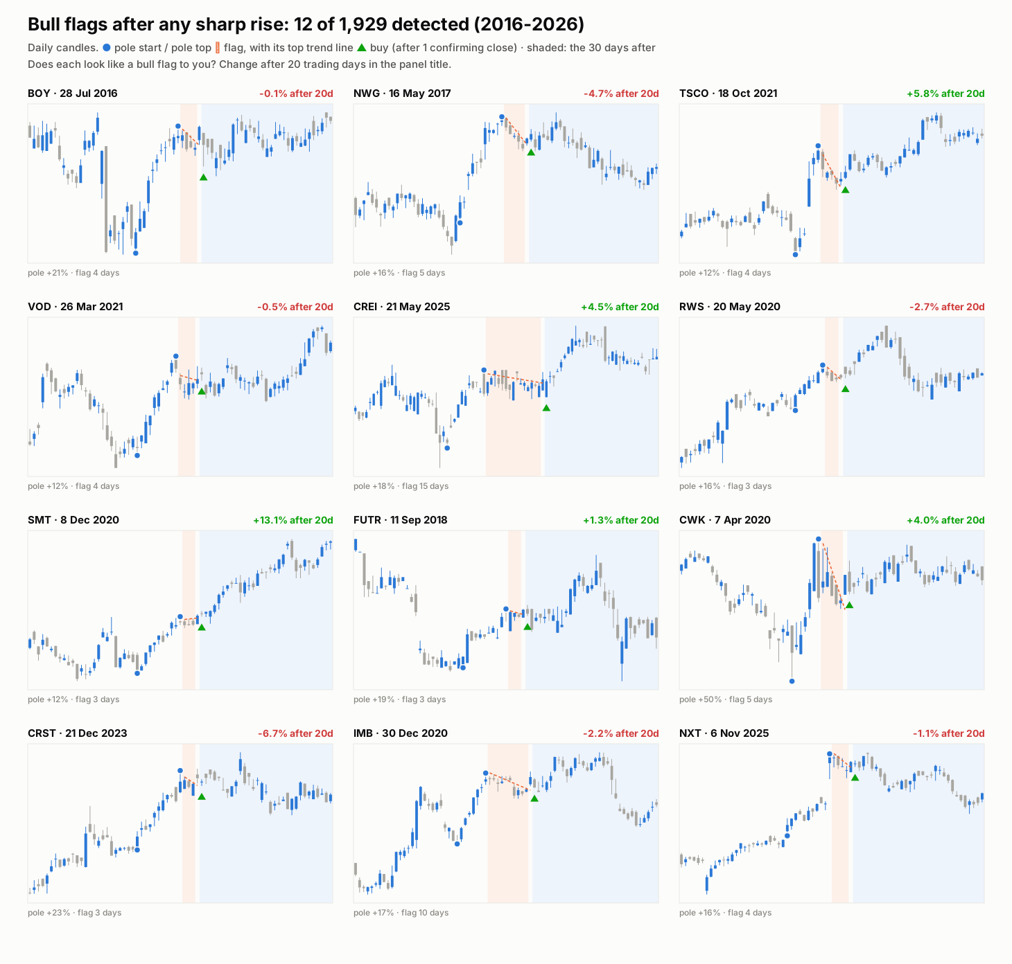
These look like flags - and their outcomes look like a coin toss: Scottish Mortgage +13% and Tesco +6%, Crest Nicholson -7% and NatWest -5%. Across all 1,929, the price 20 days after the breakout was higher in just about half of them, by +0.4% on average.
Did they work?
All tested as CFDs on a £10,000 account at 2% risk, with at most five positions open, holding 20 days:
| Run | Version | Trades | Won | Net after costs |
|---|---|---|---|---|
| #365 | Any sharp rise, stop under the flag | 802 | 30% | -£29,184 |
| #366 | Any sharp rise, wider stop (2.5x average daily range) | 614 | 44% | -£5,817 |
| #367 | Volume-spike pole, stop under the flag | 180 | 31% | -£5,320 |
| #368 | Volume-spike pole, wider stop | 151 | 51% | +£2,762 |
| #339 | EVS Drift on the same terms - buy the morning after the spike | 285 | 45% | +£7,269 |
What this says:
- The textbook stop doesn’t survive real prices. A stop just under the flag looks neat on a chart, but ordinary day-to-day wobble hits it - about two thirds of trades were stopped out, and the costs of hundreds of small-risk trades piled up.
- A flag without news is just noise. With a sensible stop, flags after any sharp rise made almost exactly nothing before costs.
- A flag after a volume spike works - because of the spike. That version carries the same edge as EVS Drift. But waiting for the flag to form and break skips about half of the trades, and the ones it takes earned less (about £18 a trade against EVS’s £25). It also lost money from 2023 onwards, where EVS kept earning.
Verdict
Fail as a strategy in its own right. Flags are easy to define and easy to find, but the shape itself carries no edge on UK stocks after costs. The one profitable version owes its edge to the volume spike inside it - and is better replaced by simply trading the spike. Together with the cup and handle and the sideways breakout, it points the same way: in Gecko’s tests, news (signalled by volume) moves prices; shapes don’t.