 GECKO
GECKO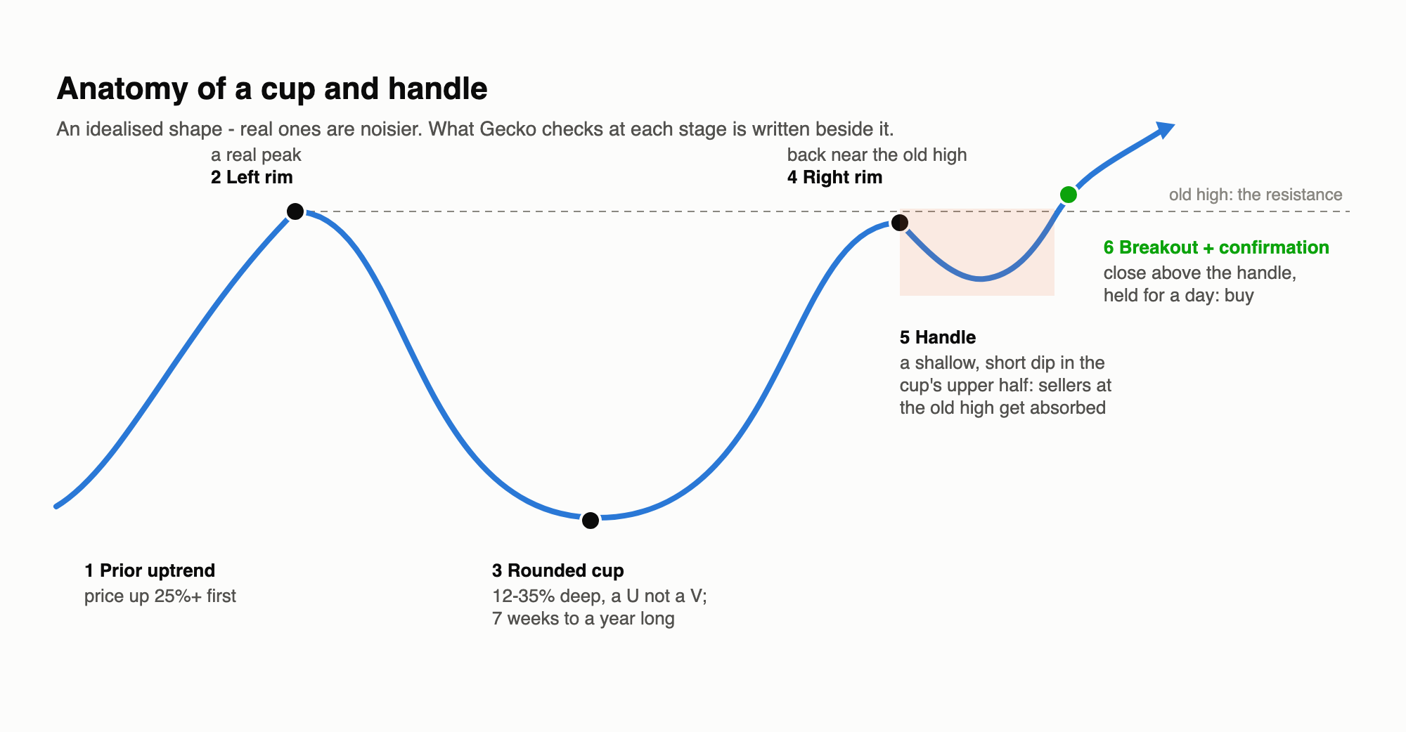
TL;DR
- The pattern: after a rise, a stock pulls back and recovers in a rounded “cup”, dips briefly in a shallow “handle” just below the old high, then breaks out. The story is that sellers waiting at the old high are absorbed in the handle, clearing the way up.
- Detecting it is possible but fiddly. Turning a shape people recognise by eye into rules took several judgement calls, and the first version picked out “cups” that a human wouldn’t. Checking the detections by eye was essential.
- It’s rare: 24 patterns in 115 stocks over ten years - about two a year across the whole list.
- It didn’t predict a rise: 40 trading days after the breakout, the price was higher in only 9 of the 24, by -1.4% on average. As trades (with a stop under the handle and a 40-day hold) it lost money after costs.
- Verdict: fail on these stocks - though with so few examples, “no evidence of an edge” is fairer than “proven useless”.
The pattern
The cup and handle was popularised by the American investor William O’Neil as a continuation pattern: a pause in an existing uptrend, not a turnaround. The psychology goes like this. Buyers who bought at the old high and watched the price fall are keen to get out at break-even, so when the price climbs back to that level some of them sell - that’s the handle. If the stock is genuinely in demand, that selling is soaked up quickly and the dip is shallow and short. Once it’s done, there’s little supply left overhead and the price can break out.
(The upside-down version is read as bearish. Gecko only tested the bullish one: its strategy builder buys but doesn’t short yet, and the bullish version would need to work first.)
Turning a picture into rules
A trader sees a cup and handle at a glance. Code needs every part pinned down - and each rule is a judgement call:
| The eye sees | Gecko’s rule (daily candles) |
|---|---|
| An uptrend first | the price rose 25%+ in the 120 days before the cup |
| A left rim | a genuine peak: nothing higher in the 20 days before it |
| A cup | 7 weeks to a year long, falling 12-35% from the left rim |
| A rounded bottom | the low isn’t at either edge, and at least 40% of the cup’s closes sit in its bottom third (a perfect U spends about 58% of its time there, a perfect V about 33%) |
| A right rim | back within 5% of the left rim, and the highest point since the cup’s low |
| A handle | 1-4 weeks, dipping no more than a third of the cup’s depth, staying in the cup’s upper half |
| A breakout | a close at least 0.5% above the handle’s high, still above it the next day - then buy at the next open |
The difficulties
“Rounded” and “a handle” are fuzzy. People recognise a U at a glance; code needs a number. Measuring how much time the price spends near the bottom separates a U from a V cleanly on idealised shapes - real prices are noisier, so the threshold is a compromise.
Where does the cup start? The eye picks the obvious peak. The first version of the detector picked the shortest cup that fitted the rules, which sometimes put the “left rim” partway down a slope. It passed every rule and still looked wrong. Requiring the left rim to be a real peak fixed it - but it was only found by drawing the detections and looking at them, which is why the gallery below matters more than any statistic.
No hindsight allowed. Looking at a finished chart, you see the whole pattern at once. A strategy only knows what had happened by the day it buys - so the detector works backwards from the breakout day and never looks at a later price. Many published examples of chart patterns quietly rely on the whole picture; ours can’t.
Every rule removes examples. Each extra condition that makes the detections look more convincing also makes them rarer. The rules above are close to the textbook ones, and they leave very few patterns to trade.
What it found
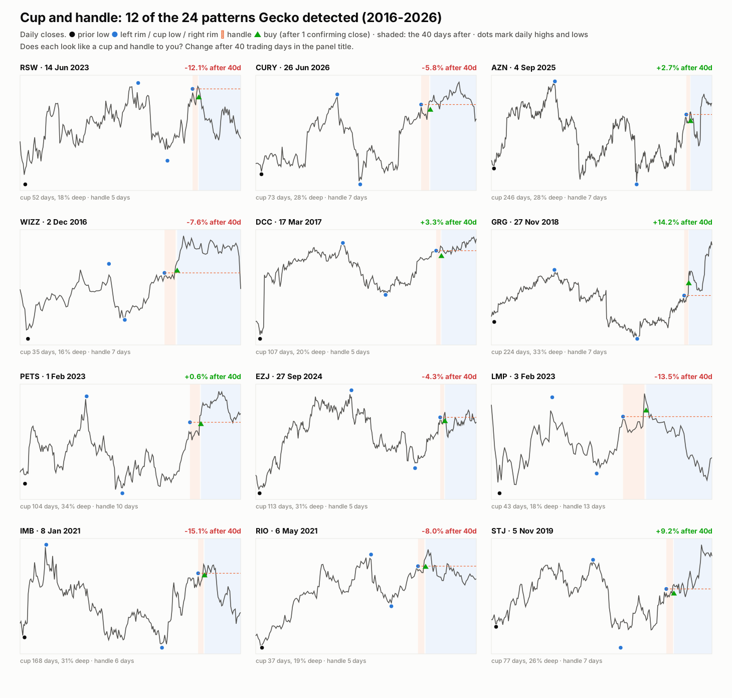
These look like cups and handles - a reassuring sign that the rules capture the shape. But look at the results in the panel titles: some breakouts ran (Greggs +14%, St James’s Place +9%), and just as many failed and fell back into the cup (Imperial Brands -15%, LondonMetric Property -14%, Renishaw -12%).
Did it predict anything?
| Patterns / trades | Result | |
|---|---|---|
| Price 40 days after the breakout | 24 patterns | higher in 9, average -1.4% |
| Traded: stop under the handle, 40-day hold (#363) | 16 trades | 31% won, -£362 after costs |
| Same, with a “measured move” target (#364) | 16 trades | -£746 |
| For comparison, EVS Drift on the same terms (#339) | 285 trades | +£7,269 |
(16 of the 24 became trades: the rest were in stocks without a CFD, or came when five positions were already open.)
Why might a famous pattern not work here? A few honest possibilities:
- Sample size. 24 examples can’t prove much either way - an edge would need to be large to show through, and there’s no hint of one.
- Different market. O’Neil drew his examples from fast-growing US stocks in strong bull markets. These are mostly mature UK large and mid caps, where an old high is often just an old high.
- Everyone knows it. A pattern this famous may be traded so widely that any edge is competed away at the breakout.
- Costs. With a stop under the handle, the risk on each trade is small, so spreads and commission are a big slice of it.
Verdict
Fail - no evidence of an edge. Teaching code to see a cup and handle is achievable, and its picks look convincing, but on UK stocks the pattern is too rare to matter and showed no tendency to rise afterwards. The detector stays in Gecko’s toolkit, so it can be combined with other signals or tried on other markets later - but the lesson so far is consistent: in this project, the strategy that works (EVS Drift) reacts to news, signalled by volume, not to the shape of a chart.